Designed for smaller screens
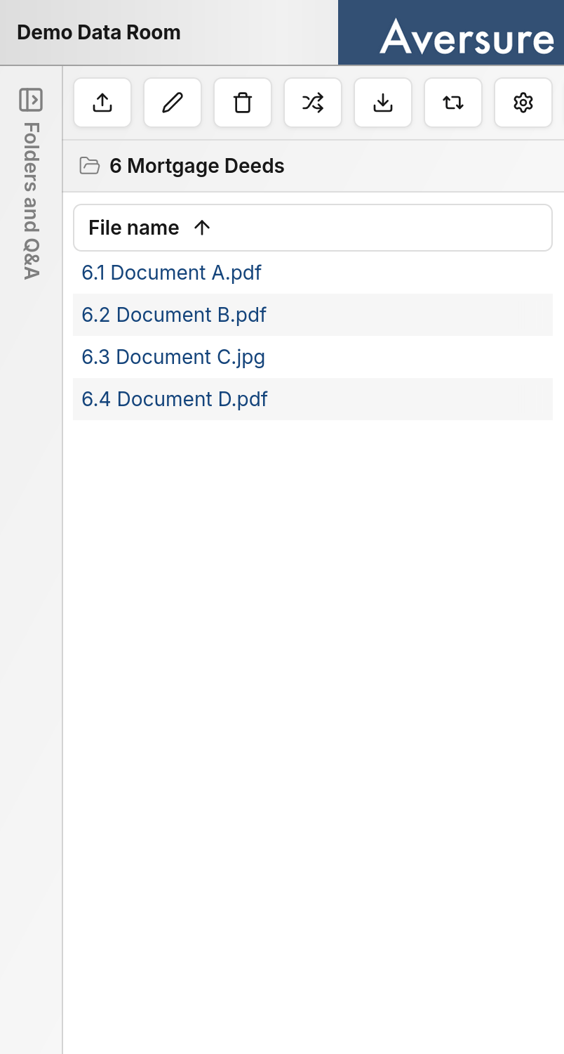
The mobile interface has been optimized for smaller screens and touch input. Layouts, controls, and navigation have been adapted so that the Service is comfortable to use on a phone without pinching, zooming, or precise pointer interactions.Differences from the desktop interface
The mobile interface focuses on the tasks you are most likely to perform on a phone. To preserve space on smaller screens, some features that are better suited to a larger display are only available on desktop.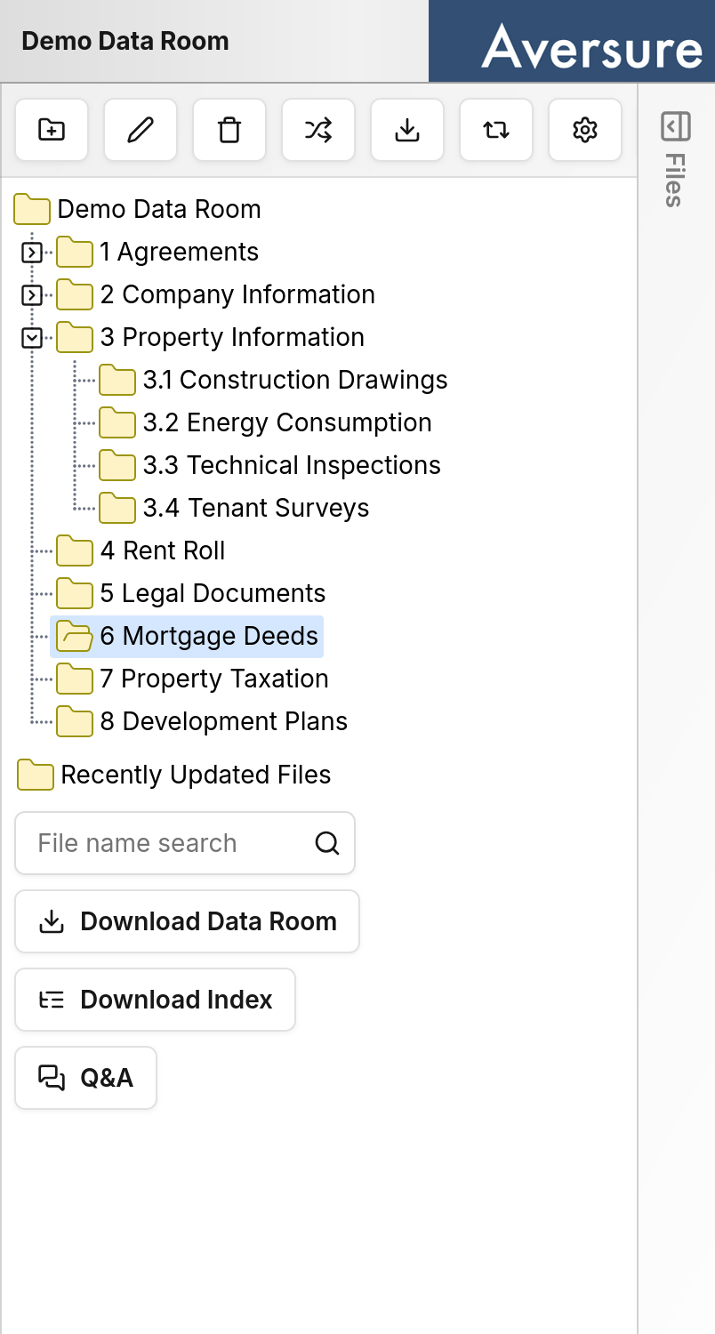
Supported browsers
The mobile interface is supported on Safari, Firefox, and Chrome on both iPhone and Android.When to use which
Use whichever interface fits the situation:- Mobile is ideal for reading documents, reviewing recent activity, and handling tasks on the go.
- Desktop is better suited to administration, bulk operations, and other features that benefit from a larger screen.